

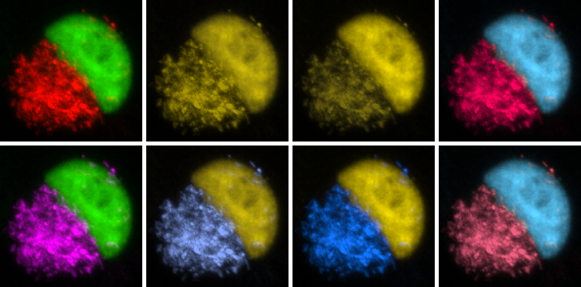
When creating scientific figures to best showcase your data, it is easy to overlook the importance of color scheme. When choosing color combinations, we tend to make our decisions predominately by what looks most appealing to our own eyes. However, it is crucial to remember that not everyone perceives color the same way. In the past, scientists often created fluorescent images and heatmaps using a green/red color scheme, making figures practically indiscernible by those with varying forms of colorblindness. The following article can help you learn to create illustrations that provide just as much contrast with arguably more visual appeal than a green/red color arrangement, increasing the accessibility of your research.
-Nina
Article on color-blindness and scientific figures.
A nifty web tool for helping you choose colorblind-friendly color schemes. Make sure to click on “colorblind safe” and “printer friendly” checkboxes.
http://colorbrewer2.org/#type=diverging&scheme=PRGn&n=3
Edited by Keith Fraga
Source suggested by Yulong Liu
For any content suggestions or general recommendations, please email to UCDBioScope@gmail.com and put science 2.0 in the title.