
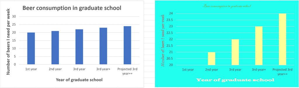
The above graphs were made from data of an anonymous 4th-year graduate student’s drinking habit, as he became an alcoholic in denial. Although the graphs were made from the exact same data, it’s obvious they give different perceptions of what the data is representing. One of the graphs indicates an alcoholic graduate student slowly increasing its alcohol consumption. The other graph suggests a more destructive trend: sobriety to a full-blown alcoholic. Bad data representation can be just as detrimental as bad data. Anna Feitzinger from the Lott Lab sent me this very useful website discussing common problems faced when graphing data. It has example problems, clear solutions, and some even have convenient practice R code.
https://www.data-to-viz.com/caveats.html
Yulong
Suggested by Anna Feitzinger
Edited by Sydney Wyatt
For any content suggestions or general recommendations, please email to UCDBioScope@gmail.com and put science 2.0 in the title.